

UX DESIGN | InteractSport
Client: InteractSports provides a complete sports management platform servicing National Sporting organisations (NSO’s), associations, clubs and teams worldwide. Some of the clients include Cricket Australia, Netball Australia, Football Federation Australia, ECB, Cricket Ireland etc.
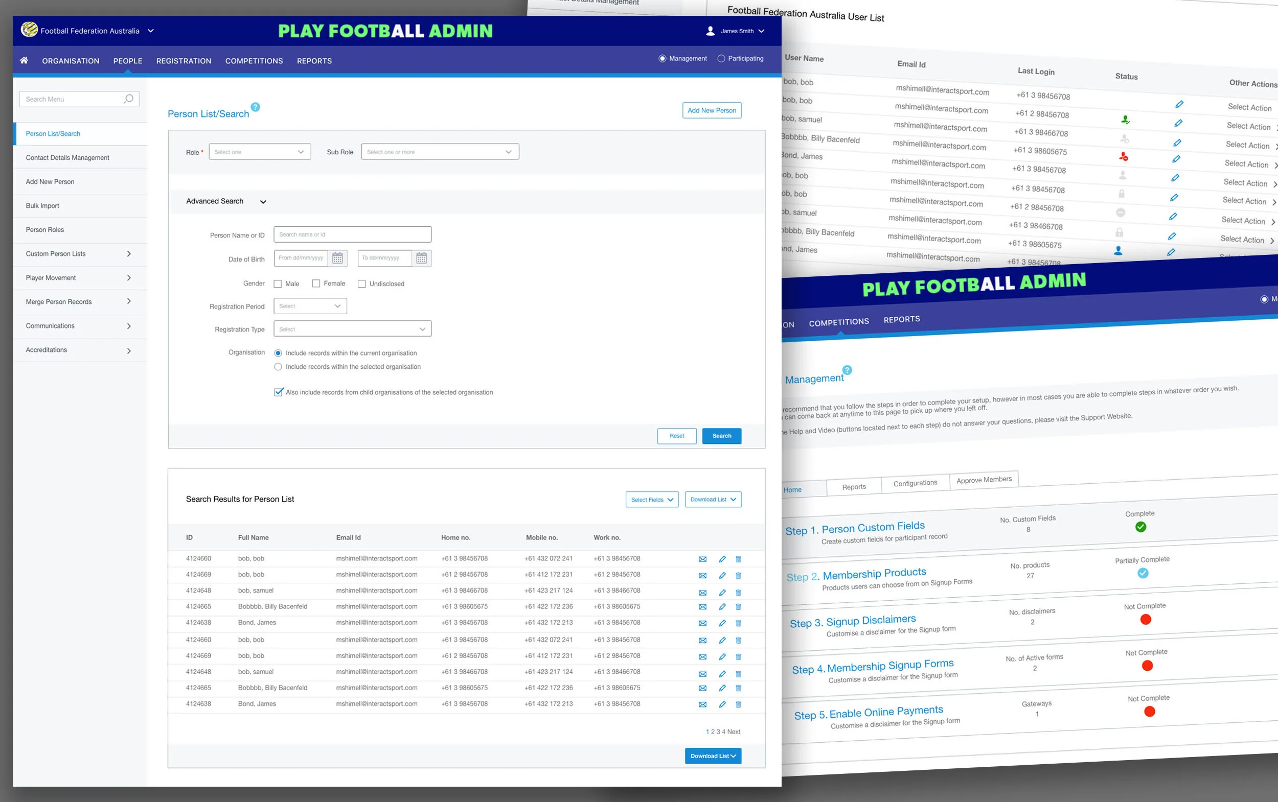
Brief: InteractSport were seeking to improve the navigation, visual design and overall user experience of their key web platform – ResultVault, a competition and participant management platform which enables to organise and manage sports at all levels. The key objectives were:
Global product UI and UX improvements
Refine navigation for better ease of use
Improve overall usability and user experience
My Role:
Being a solo UI/ UX Designer on the project, I was responsible for:
Requirement gathering and identification of key user flows, common UI elements and patterns for MVP
Creation of navigation design, UI elements, key templates and visual designs
Style guide and UI design specification guidelines document for consistent user experience
Collaborated with Product owner, developer and senior stakeholders
Background:
The original, in-house developed, web platform was created primarily by the developers based on the specifications - it had all the content, and lots of it, but certainly lacked the usability and visual appeal.
The primary users of this platform were Administrators and parent volunteers of the sporting clubs. Some were casual (occasional) users while others were one time users. No standardisation of tasks and patterns meant users had to learn and relearn the process every time they had to perform a different task. Users found the platform difficult to use, took longer to accomplish a task than needed, and also required frequent support from the help desk.
Problem Statement:
How can we make the platform intuitive, easy to use and provides consistent user experience.
Solution approach:
Based on the product walk through, stakeholder meeting and non-negotiable time line (fixed launch date), it was agreed to:
Identify inconsistencies in the UI design, site navigation and the user experience
Prioritise key user flows for the MLP (Most Loveable Product)
Establish common UI elements and prepare reusable design themes, patterns and templates to support the rapid deployment
Prepare design specification guide and ‘UI kit’ to support the roll outs
Platform Review
To begin with, I focused on some of the most important screens and templates including the dashboards and the landing pages for each module. I also reviewed key user tasks to improve the flow. During this process many inconsistencies emerged. I documented them which helped deciding in prioritisation.
Next, I identified global and local UI design patterns and elements which could be standardised and reused throughout the platform to create a consistent experience for the user.


Insights:
No clear distinction and co-relation between primary and secondary navigation made it difficult for users to locate where they were in the flow.
All inputs were presented in one step, which made task look overwhelming and never ending.
Lots of UI elements and controls made screen appear very “busy” and less intuitive for the user.
No standardisation of tasks and patterns, which meant users had to learn and relearn a process every time they had to perform a different task.
Design Exploration:
After identification and prioritisation of templates and design patterns, I started sketching and exploring different ways to address and solve the pain points in the existing platform. First, I addressed navigation and visual designs for the overall look, right from the fonts type, colours and other UI design elements. I presented prototypes of the templates and flows to the stakeholders and improved based on their feedback.


After a few rounds of iterative feedback loop, I started designing the landing pages for each module including homepage, dashboards, registration, search and other pages.
fINAL dESIGNS:
The key objectives for the interface were that it must be clean, simple, intuitive to use and easy to customise to the different sporting bodies. This was accomplished through the use of neutral colours, customisable headers, modular and reusable components for a consistent experience across the platform.
I created a high-fidelity designs in Adobe XD which served as pixel-perfect reference images as well as designs for the overall platform.
Solution design:
Refined Navigation for better ease of use
Progressive disclosure was used to reduce the cognitive overload
Step wizard was used to breakdown the long data entry forms and screens
Design rules and detailed specifications were established for the UI elements and components
Standardised design guidelines for all common elements such as search, advanced search, display of search results, input fields, drop down lists etc.
Collection of modular and reusable components that can be combined together to create intuitive designs


STYLE GUIDE AND UI Design Specification Document
UI design style guide was developed based on the design best practices and was backed up by a comprehensive design specification document for the developers to ensure consistency and scale.

Outcome:
The redesigned ResultVault was very well received by the internal and external users.
